Features
This page explains everything the application can do for you.
Key Feature Highlights
🖥️ Native Desktop App
Runs as a native window on Mac (WebKit), Windows (WebView2), and Linux
No browser required - just
python -m degiro_portfolio --desktopServer starts and stops automatically with the window
Also available as a web server for browser-based access
📊 Real-Time Portfolio Tracking
View all your holdings in one place with live prices
See your total portfolio value and gain/loss at a glance
Track performance over time with interactive charts
💰 Multi-Currency Support
Automatic EUR conversion for USD, SEK, GBP stocks
All position values displayed in EUR for easy comparison
Price charts show original currency for accuracy
📈 Interactive Charts
Candlestick price charts with transaction markers
Position value percentage tracking (above 100% = profit)
Individual investment tranche performance
Market comparison against S&P 500 and Euro Stoxx 50
⚡ Easy Data Management
One-click market data updates
Drag-and-drop transaction file uploads
Automatic price fetching for all stocks
🔒 Privacy First
All data stored locally on your computer
No cloud services or external servers (except for price downloads)
Full control over your financial data
Visual Overview
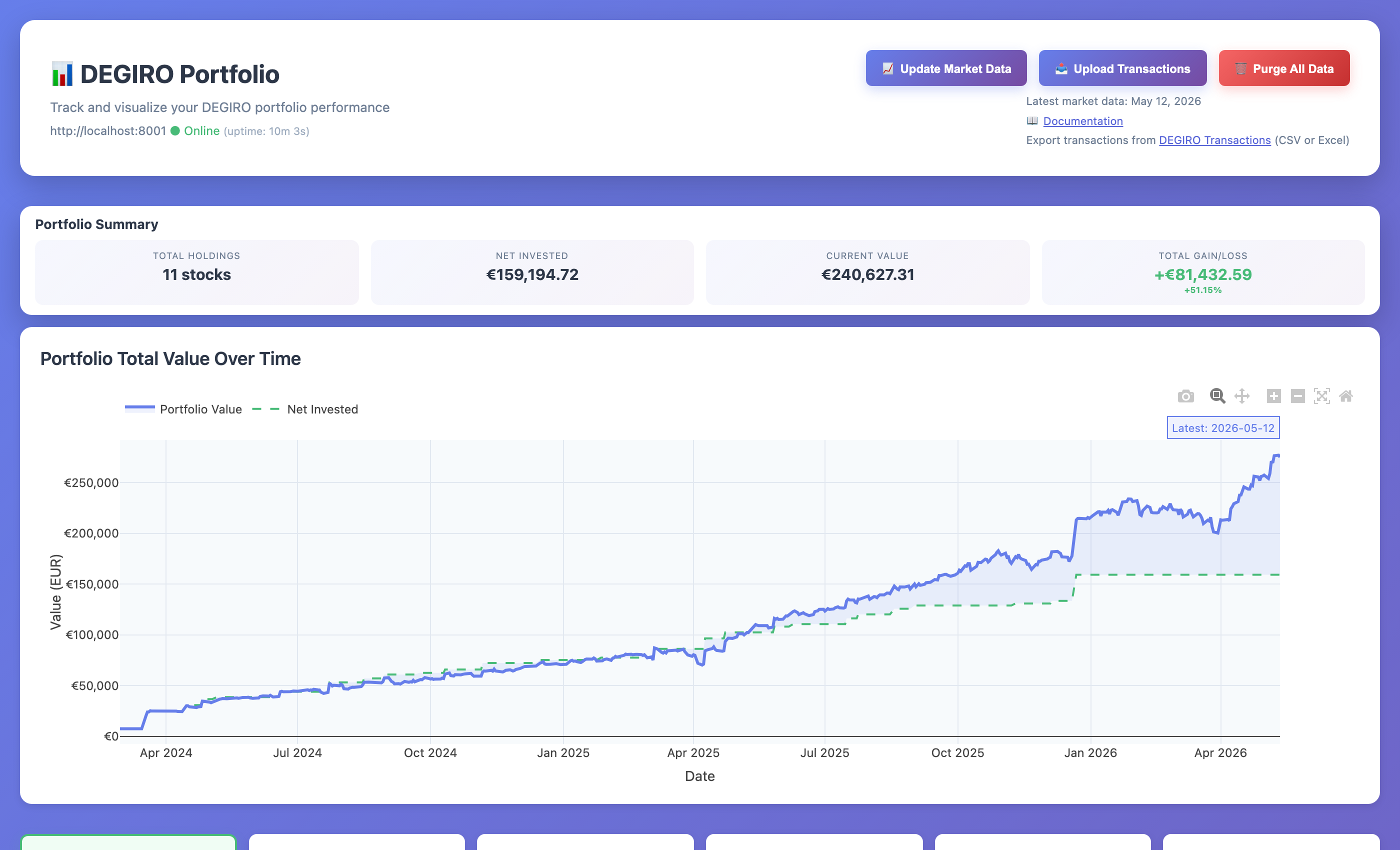 Main dashboard showing portfolio summary, action buttons, and stock holdings
Managing Your Portfolio
Importing Your Transactions
What it does: Takes your DEGIRO transaction history and imports it into the application.
✅ Drag and Drop Upload - Click the upload button, select your Excel file from DEGIRO, done! ✅ Automatic Stock Detection - The app automatically recognizes all your stocks ✅ Multi-Currency Support - Works with EUR, USD, SEK, GBP and automatically converts to EUR ✅ Smart Processing - Links all your buy/sell transactions together for each stock
How to use: Click “📤 Upload Transactions” in the web interface, select your DEGIRO Excel export.
Getting Price Data
What it does: Downloads historical stock prices so you can see charts and track performance.
✅ Automatic Download - Prices download automatically when you upload transactions ✅ One-Click Updates - Click “📈 Update Market Data” to refresh all prices ✅ Market Benchmarks - Also downloads S&P 500 and Euro Stoxx 50 for comparison ✅ Fast Access - All data stored on your computer for instant viewing
How to use: Prices update automatically on upload. Click “Update Market Data” anytime to refresh.
Portfolio Overview
The main dashboard provides:
Stock Cards
Each stock displays:
Company name and ticker symbol
Current share count
Latest closing price
Daily percentage change (▲ increase / ▼ decrease)
Exchange information
Transaction count
Market Data Status
Shows the most recent price update date
Helps you know when data was last refreshed
Interactive Elements
Clickable Tickers: Links to Google Finance for quick reference
Company Names: Links to Google search for investor relations
Compact Design: Space-efficient layout showing all key information
Portfolio Summary at a Glance
The Portfolio Summary section displays your key metrics in an easy-to-read format:
Metric |
What It Shows |
|---|---|
Total Holdings |
Number of different stocks you own (e.g., “6 stocks”) |
Net Invested |
Total amount you’ve invested in EUR (e.g., “€105,061.37”) |
Current Value |
Current total value of your portfolio in EUR (e.g., “€172,102.88”) |
Total Gain/Loss |
Your profit or loss with percentage in green (profit) or red (loss) (e.g., “+€67,041.51 +63.81%”) |
Portfolio Value Over Time Chart
Below the summary, you’ll see a Portfolio Total Value Over Time chart showing:
Blue solid line: Your portfolio’s current value over time
Green dashed line: How much you’ve invested (net invested)
Gap between lines: Your profit (when blue is above green) or loss (when blue is below green)
Latest annotation: Shows the most recent date with exact value
This chart gives you a complete picture of your investment journey, showing both how much you’ve put in and how your investments have performed.
Stock Cards
Each stock is displayed in a card showing:
Company Name (clickable - opens Google search for investor relations)
Ticker Symbol (clickable - opens Google Finance)
Exchange (where the stock trades)
Number of Shares you own
Current Price with daily change indicator (▲ green for up, ▼ red for down)
Position Value in EUR (automatically converted from stock’s currency)
Transaction Count (how many times you’ve bought/sold)
Click any stock card to see detailed charts for that stock.
Understanding the Charts
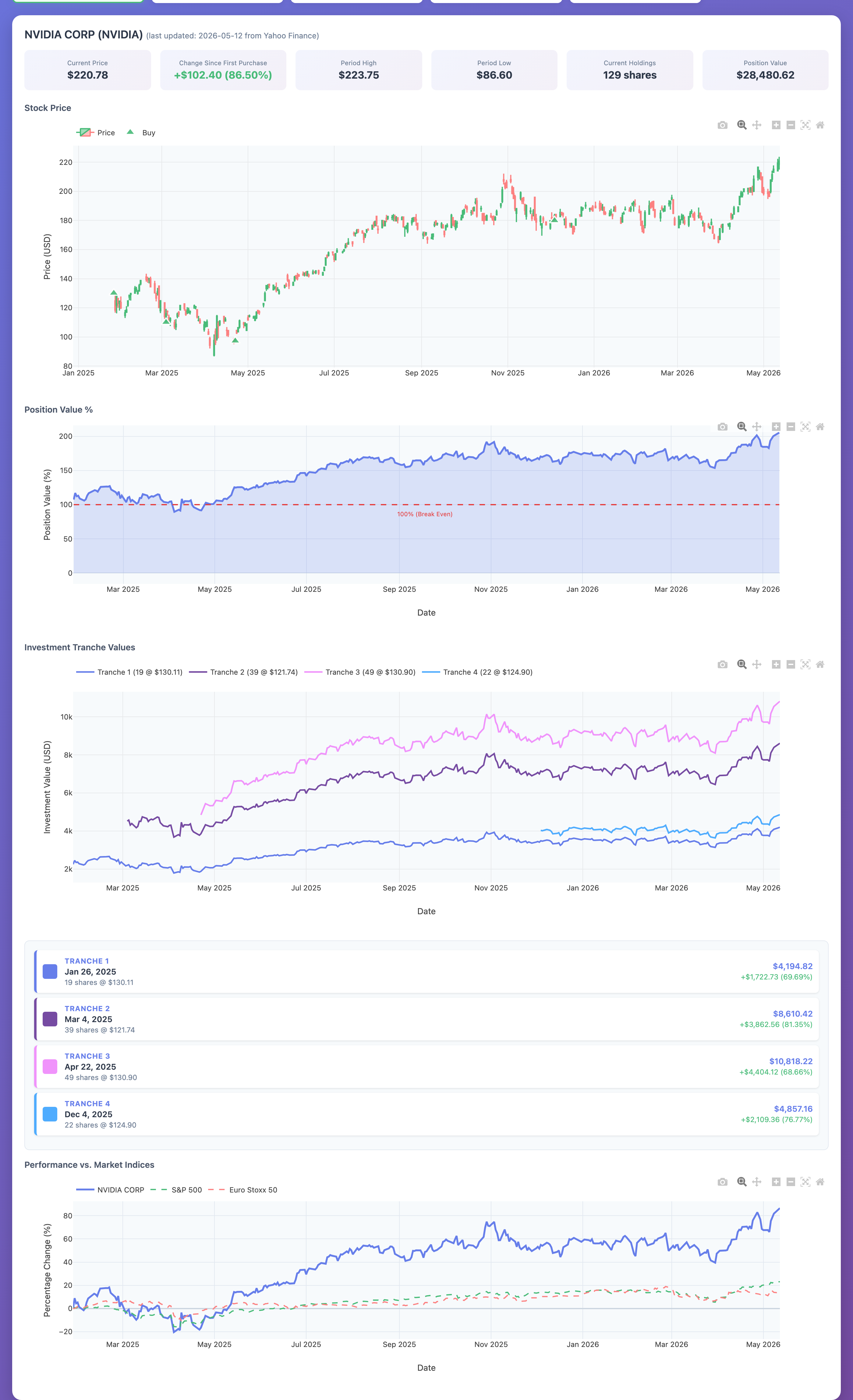 NVIDIA stock detail showing price chart with buy transactions, position value %, investment tranches, and market comparison
When you click on any stock card, you’ll see four interactive charts:
1. Price Chart (Candlestick Chart)
What it shows: Historical stock price movements with your buy/sell transactions marked.
How to read candlesticks:
Each bar represents one day
Green bars = Price went up that day (closing price > opening price)
Red bars = Price went down that day (closing price < opening price)
Tall bars = High volatility (large price swings)
Short bars = Low volatility (stable price)
Transaction markers:
Green triangles (▲) = Your buy transactions
Red triangles (▼) = Your sell transactions
Hover over markers to see exact date, quantity, and price
Interactive features:
Zoom: Mouse wheel or pinch gesture
Pan: Click and drag left/right
Hover: See exact OHLC (Open, High, Low, Close) prices for any day
Reset: Click the home icon to reset zoom
Why it’s useful: Understand the stock’s historical performance and see how your purchase timing affected your returns. Did you buy at a good price? The markers show exactly when you entered positions.
2. Position Value % Chart
What it shows: Your profit or loss as a percentage of your investment over time.
How to read the percentage:
Line at 100% (horizontal dashed line) = Break-even point (no profit, no loss)
Line above 100% = Profit! You’re making money
110% = 10% profit
120% = 20% profit
150% = 50% profit
Line below 100% = Loss. Your position is worth less than you paid
90% = 10% loss
80% = 20% loss
50% = 50% loss
Real example from your portfolio: If you invested €10,000 and the chart shows 125%, your position is now worth €12,500 (25% gain, or +€2,500).
Why this is different from price change:
This tracks YOUR position value, not just the stock price
Takes into account ALL your purchases at different prices
Shows how much money YOU have made/lost total
More meaningful than just looking at current price
Why it’s useful: This is the chart that answers “Am I actually making money on this investment?” It’s the most important chart for tracking your personal returns.
3. Investment Tranches Chart
What it shows: Performance of each individual purchase (tranche) separately.
What is a tranche? A “tranche” is simply one purchase transaction. If you bought the same stock on three different dates, you have three tranches.
Example scenario: Let’s say you bought NVIDIA stock three times:
Tranche 1: April 1, 2024 - 10 shares @ $120 = $1,200 invested
Tranche 2: June 1, 2024 - 5 shares @ $150 = $750 invested
Tranche 3: August 1, 2024 - 15 shares @ $100 = $1,500 invested
The tranche chart shows how each of these purchases is performing individually.
Why this matters:
See which purchases were good timing and which weren’t
Understand your cost basis (average purchase price)
Identify if dollar-cost averaging (buying at different times) is working for you
Useful for tax planning (which shares to sell first)
How to read the chart:
Each colored line represents one purchase
Lines going up = that purchase is profitable
Lines going down = that purchase is at a loss
Hover over any line to see exact purchase details and current value
Below the chart: You’ll see tranche cards showing:
Purchase date and price
Number of shares
Current value
Profit/loss in both amount and percentage
Why it’s useful: Helps you understand if your buying strategy is working. Maybe you consistently buy at highs or lows - this chart reveals your patterns.
4. Market Comparison Chart
What it shows: How your stock performs compared to major market indices (benchmarks).
The three lines you see:
Your Stock - The individual stock’s performance
S&P 500 (^GSPC) - Represents the overall US stock market (500 largest US companies)
Euro Stoxx 50 (^STOXX50E) - Represents the European market (50 largest EU companies)
How to interpret the comparison:
All lines start at 0% (normalized from your first purchase date)
Lines going up = positive returns
Lines going down = negative returns
Your stock line ABOVE the indices = Outperforming 🎉
You picked a winner! Your stock is doing better than the overall market
Example: Your stock is at +40%, S&P 500 is at +20% = You’re beating the market by 20%
Your stock line BELOW the indices = Underperforming 📉
The market is doing better than your stock
Example: Your stock is at +10%, S&P 500 is at +25% = You’re lagging the market by 15%
Consider: Would you have been better off in an index fund?
Why this matters:
A stock being “up” doesn’t mean it’s good - it needs to beat the market
If your stock is up 5% but the market is up 20%, you actually underperformed
Helps you evaluate if your stock picking strategy is working
Shows if you should just invest in index funds instead
Example interpretation: “My tech stock is up 50% (great!), but the S&P 500 is up 60% (better). I underperformed by 10%. Maybe I should reconsider my stock selection strategy.”
Why it’s useful: Provides context for your returns. Making money isn’t enough - you want to beat what you could have made in a simple index fund.
Tips for Using the Charts Effectively
Mastering the Interactive Controls
Chart Toolbar (icons in top-right corner of each chart):
📷 Camera - Download chart as image (PNG)
🔍+ Zoom In - Magnify specific area
🔍- Zoom Out - See more data
🔲 Box Select - Drag to select and zoom to specific date range
🏠 Home - Reset to default view
↔️ Pan - Move left/right across time
🔄 Autoscale - Fit all data in view
Keyboard/Mouse Shortcuts:
Mouse Wheel - Zoom in/out on charts
Click & Drag - Pan across timeline
Double Click - Reset zoom
Hover - See exact values at any point
Answering Key Investment Questions
The charts are designed to answer specific questions about your investments:
Question |
Chart to Use |
What to Look For |
|---|---|---|
“Am I making money overall?” |
Position Value % |
Line above 100% = profit |
“Did I buy at a good time?” |
Price Chart |
Green markers near price lows |
“Which purchases were best?” |
Investment Tranches |
Highest percentage gains |
“Am I beating the market?” |
Market Comparison |
Your line above S&P 500 |
“How’s my portfolio growing?” |
Portfolio Value Over Time |
Blue line trending up |
“What’s my best stock?” |
Compare Position % across stocks |
Highest % above 100% |
Pro Tips for Analysis
1. Check Multiple Time Frames
Zoom into recent months to see short-term performance
Zoom out to years to see long-term trends
Different timeframes tell different stories
2. Compare Before Major Events
Look at performance during market crashes
See how your stocks held up vs the market
Learn if your portfolio is defensive or aggressive
3. Use Tranche Data for Strategy
If early purchases always outperform, maybe buy less frequently
If dollar-cost averaging (multiple purchases) works, keep doing it
Identify if you have a pattern of buying high or low
4. Track vs Benchmarks Regularly
Check monthly if you’re beating S&P 500
If consistently underperforming, consider index funds
Outperforming 60% of the time is considered good
5. Screenshot for Records
Use the camera icon to save chart images
Keep records of your performance over time
Compare year-over-year progress
Managing Your Data
Clearing All Data
What it does: Removes all your transactions and price data if you want to start fresh.
How to use:
Scroll to the bottom of the dashboard
Click the red “⚠️ Delete All Data” button
Confirm the deletion
Warning: This permanently deletes everything! You’ll need to re-upload your transactions.
When to use it:
You want to start over from scratch
You uploaded the wrong file and want to clean up
You’re testing the application with demo data
Viewing Server Logs
If you need to troubleshoot issues, you can view the server logs:
degiro_portfolio logs
This shows recent activity and any error messages.
Multi-Currency Support
What it does: The app works with stocks in different currencies and converts everything to EUR for easy comparison.
Supported currencies:
🇪🇺 EUR (Euro)
🇺🇸 USD (US Dollar)
🇸🇪 SEK (Swedish Krona)
🇬🇧 GBP (British Pound)
How it works:
Stock prices display in their original currency
Position values automatically convert to EUR
Exchange rates update daily
Charts show prices in the currency you bought/sold in
Example: If you own US stocks (priced in USD) and European stocks (priced in EUR), the app shows your total portfolio value in EUR so you can easily compare them.
What You Can Track
The application shows you:
Portfolio Level
✅ Total Portfolio Value - Sum of all your investments in EUR ✅ Overall Gain/Loss - How much money you’ve made or lost overall ✅ Number of Holdings - How many different stocks you own
Individual Stock Level
✅ Current Value - What your shares are worth now ✅ Purchase Price - What you originally paid ✅ Profit/Loss - Difference between current value and what you paid ✅ Percentage Return - Your profit/loss as a percentage ✅ Daily Change - How much the stock moved today ✅ Share Count - Number of shares you own
Performance Tracking
✅ Historical Performance - How your stocks have performed over time ✅ Market Comparison - How you’re doing vs S&P 500 and Euro Stoxx 50 ✅ Transaction History - All your buy/sell transactions with dates and prices ✅ Tranche Performance - Performance of each individual purchase
Additional Features
Quick Links
Click any company name to search Google for investor relations info
Click any ticker symbol to view the stock on Google Finance
Click “Update Market Data” to refresh all prices instantly
Data Privacy
All data stored locally on your computer
No account required
No data sent to external servers (except to download stock prices)